Thursday, 11 July 2024

Dean Hughes: Felt Tip Drawings


Dean Hughes - 'Felt Tip Drawing No 2' (2024), ink on paper, 210mm x 297mm.
Photograph by Michael Pollard. Courtesy Moon Grove.

The Moon Grove contemporary art space (Manchester, UK) is currently home to Dean Hughes exhibition 'Felt Tip Drawings'.

Hughes has spent the last few decades editing the white noise of the world by producing small sculptures and domestic scale work on and with paper. The linearity of threads and cuts, the puncture and catch of stitch, process and procedure directing him towards a binding reductive aesthetic, but all carrying a polite invitation to concentrate on the materiality grounding his minimal interventions on A4 paper and miniature cardboard birdbox-like shapes. Small articles compressing the ponderous heft and bulk of traditional minimalist sculpture into intimate moments, removing the aggressively impersonal quality of the monumental.

So, considering his previous work, the prospect of a 40 piece drawing show on Moon Grove’s exhibition walls threatens to verge on rococo insanity.

Fortunately, the badgering meanness of meaning is healthily wrongfooted and the work avoids the dampening slap of academic reductionism, an undermining playfulness humanizing his trademark disciplined attention to detail.

As always with Hughes, modalities of attention are at the fore bringing to mind William James notion of ‘attention’; the taking possession by the mind of one out of what seems several simultaneous trains of thought, the withdrawal from some things to deal effectively with others, as, without selective interest, experience is an utter chaos. Foundational to cognition is a selective precision within focussed attention and the work hinges on this observation.

The first drawing on the entry passage wall shows an anaemic curvature of looping forms sitting on top of the empty substrate of a blank white ground, as empty and weightless as a balloon it still has the organisational certainty of an architectural plan. On closer inspection the lassoing number 8 shape proves to be cuts in the paper. A regular density of cut maintains the illusion of a drawing deposit of ink or pencil graphite; drawing as an absence and as a tangible marking. Additionally, colourful bleeds of felt tip pen inks stain the paper edges on both sides of the cut giving the twinkle of a rainbow thread to the reassembled collaged drawing. There is a gentle phosphene complicity showing the limitations of the visual, the glitching flicker of rods and cones defamiliarizing the materially known.          

This technique of colourful staining by a fine bleed into the edge of papers fibre further complicates matters as it embeds the notion of the painterly into the mix.  A muffled molecular nervousness at odds with the confidently regular width of the cut lines. Almost apologetically discrete coloured sutures, they hijack the meditative hum of a doodlers meandering output.  

The other 39 drawings are roughly grouped in different spaces according to a connective tissue of stylistic similarities. The front room area has largely geometric shapes; inset rectangles, individually or in twos and threes, a simple stacking of triangle into boxy squares, and so on. The next, more idiosyncratic forms mixing straight lines and curves, some seem like overinflated alien letters, there’s an occasional circle. Other display areas have solo works with the line casually wandering with a dreamy indifference, sometimes barely registering as though a cameo from another drawing.

However, the drawings source material may well not originate with Hughes. This is never clear. There is also a wilful amnesia regarding drawings presumed functions, is it a disciplining of mark-making for constructive transcriptions, directive rumblings from the psyche, a mapping of the body’s mechanical capabilities? By reducing hand-generated marks and lines to alien traces of all these possibilities simultaneously the ‘doodles’ become apparitions outside the confines of any notion of lucidity of functional expressive intention. A dismantled codex of drawings formal possibilities infecting Moon Grove’s exhibition walls.

Further, the various groupings and clusters of framed A4 drawings tend towards an implied conventional grid format but with gaps and absences leaving static overhead views of changing car-park huddles of the rectangular format. A suggestion of movement and interchangeability between the A4 units which adds a further feeling of long-term mutability to the drawings internal structures.

So these drawings are both absences and compressions harvesting echoes of loose expressive mark-making and the functionally diagrammatic for decorative and formal impact. 

For all their apparent simplicity they demand a degree of attention to detail from the viewer paralleling the attention to detail required for their production. The mediums unanchoring flexibility is placed on display but with a caveat. Drawing is a playground and straitjacket for imaginative wanderings. 

Any mediums fuller potential can only be perceived by a shift in the conceptualising perspective of the viewer. A richer engagement with the grounding materiality of the medium becomes the beginning of the pleasurable act of thinking sideways. 

Surely a positive outcome for any art show.


Dean Hughes - 'Felt Tip Drawings' 
31 May to 27 July 2024

Open Thursdays and Fridays
12pm to 6pm during exhibition

Moon Grove
7 Moon Grove
Manchester
M14 5HE
United Kingdom

+44(0)7713930510
mail@moongrove.org


Monday, 9 October 2023

Imogen Reid: Works on Paper


Imogen Reid's work on paper maintains a compromise between informational clarity and poetic formalism. Erasures, mirrored forensic repetitions and layered overprinting coexist within the tonally ambient meshing of papers textured materiality and artisanal fragility.

Against the obdurate solidity of the concrete Reid posits a multiplicity of repetitions, deformations and subtractions, paper acting as both substance and display screen. Attracted to the transformative movement of the sequential, a way to activate these necessarily inert spatial concretions, Reid conceptually disassembles form, line and the quiet texturing of the page and reassembles momentary constellations of these foundational elements.

The standard directional drag of the reading process is never fully discarded but subtly reweighted in Reid's work. The patterns and grids present themselves as fractal lines of alien text and holistic unities at one of the same time. An active conceptualising process, an anchoring pivot swings the viewer's mode of apprehension from the linearity of text to the bold certainty of graphic solidity.

However, no matter how formally fixed these renderings seem they side-step the calcifying deadness of geometric solidity. Taut and colourful parallel threads imply the anonymity of structuring language’s granular multiplications of atomic units whilst foregrounding the vibrancy of communicative potentialities in a fresh creative jigsawing together of basic visual elements.

A reader-viewer’s physical proximity to the page also allows a visual blurring, a humanizing vulnerability announced by the subtle tactility of the structuring linearity of the printed designs. The implied narrative pull of parallel lines reveal themselves to be territorial mappings of the material, simultaneously synthetic and organic, the burr of fraying threads momentarily static but always straining towards a breaking point and alternative constructive possibilities.

Interweaving and interleaving constructive options for patterns of illegibility within the ecosystem of a book form adds a further temporal dimension to the process of absorbing the visual. The publication becomes a gentle feedback loop of austere calligraphy, a layering of mutating woven genetic codes, a wiry motility embedded in the material fact of the book- object.

An implication of the ambient pin-point flicker of illuminated pixels seems to comfortably coexist with the disciplined rigour of the hand-crafted, the tender bleaching of a potentially strident palette maintaining a consistency of decorative restraint.

Ultimately, the work acts as a refined glossographia of the barebones of visual constructions, an organized grouping of visual elements dependent on activation by the readers eye and hand. Looking and experiencing become sensitive manipulations prompted by the author-artist but never at the expense of losing the democratic and participatory nature of cultural discourse. The hands of the readers as much as their eyes will finally dictate the cumulative resonance of the pages.

A new publication will shortly be released through http://www.rossicontemporary.be/

Reid’s work has appeared in Hotel Magazine, LossLit, Gorse Journal, Zeno Magazine, Elbow Room, and ToCall Magazine. She has participated in Steven J Fowler’s Poem Brut events, and has a pamphlet with Gordian Projects. 


Tuesday, 4 July 2023

Simon Pantling: Flyover


                                                                                                                   'Support' (2023)


Photographer and film-maker Simon Pantling has an exhibition of digitally rendered drawings at Matt Houlding’s Studio2 in Todmorden.

Using an Apple Pencil to simulate pencil on paper, Pantling has produced a dozen sketches of areas, hidden no-places and voids beneath and abutting Manchester’s Mancunian Way flyover. Some are largely transcriptions of digital photographs; others compacts of remembered generic spaces and actual locations.

All are approximately A4 size and quite painstakingly detailed echoes of concretely material solidity.

Drawing as a process, procedure, discipline (whichever you prefer), has always been intimate with scientific tinkering and optical structuring of space. Reclining nudes viewed through wire meshes, all the better to accurately transfer the view onto a rectangular surface. Figures and objects projected onto canvas to trace and compose. And so on.

That said, the artfulness of drawing as an expressive concept, even if using pen, pencil, or even old school indexical photography, has always been, in reality, commensurate with a hidden historical assumption that technology's ability to anchor the pictorial is restrained by a controlling human, almost metaphysical, directive. Or at least a human capacity to milk more from the mechanistic image thievery than just casual attractive renderings of fragmentary moments of the world as it plods through its daily cycles.

Pantlings images question the disingenuous ethical solidity of this barely hidden presumption. And that is their primary strengths. The quotidian dependence on a distancing faux sentimentality is really emphasised by this process of image production. These places, spaces, concrete moments, like the deformations of faulty memories, just are.

Formal slabs of material seem like sliding areas demanding a conceptual opacity to allow the eye to architecturally negotiate the dead spaces. They prompt a suggested visual wandering through non-areas between more presentable expressions of contemporary urban living. There’s a constant deferral of emotive engagement by the transcriptive process of photo to linear drag and fill of sketchy space. This onion layering of contemporary media, photographs, procreate transcription, editing decisions using new technology, the final prints, these all depend upon images which could only happen through the ‘digital’. They are a presentation of an aestheticised staged environment with an austerity dependent upon a peculiarly contemporary compact of media.

For all their blocky solidity there is no sense of actual material reality, no room for the beige slop and seepage of puddling muck of the dead spaces of urban centres in these pictures. The addition of fragmentary torn posters and graffiti seem like simulations of stains of human engagement; sarcastic mucky fingerprints announcing an urban pastness of no more consequence than a casual smear or footprint; a qualitatively pointless addition to the directive physical masses undergirding an urban centre. Decorative additions of limited consequence outside a misremembered past they seem to strain to give character to spaces indifferent to human presence.

To further emphasis the compact between scientific tomfoolery and the hand wrought, the transcriptive feathery markings digitally formed to mesh into drawing-like expressions of a remembered moment are both convincingly engaging and offputtingly unnerving.

Sophisticated and attractive, efficiently rendered but coolly indifferent, the cumulative effect is one of aesthetic pleasure in the alienness of the functional everyday. 

Thursday, 18 August 2022

Rebecca Sitar: The Obstinate Muteness Of Things


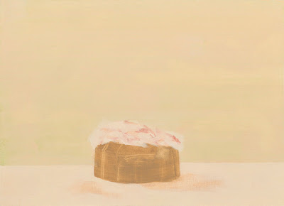
                                                                   'Casket' (2021)

Manchester-based artist Rebecca Sitar’s recent joint exhibition with Dan Roach, ‘Mudlarks’, was a pleasant reminder that, in a zeitgeist still rather taken by formal hybridity in contemporary art, an unshowy refinement of a practice has its own benefits.

‘Mudlarks’ was the name applied to nineteenth century riverbank scavengers patrolling the intertidal flats of the Thames to unearth objects still carrying a use value. It is also suggestive of the magpie lark of Australian descent which builds nests from mud and twigs, a kind of constructive and functional alchemy not unlike the building site of a painting, itself constructed from stubbornly solid surfaces and painterly muck.


The vague, almost recognisable, single objects that dominate Sitar’s paintings either hover in front of surface washes of milky and muted colour or emerge x-ray-like from the quiet ground of the pictures. So, in ‘Under the Skin’, a horizontal twig shape is sharply foregrounded on a background of cool blue-white; whereas ‘Red Velvet In Thin Air’ seems to gather a cloudy orange-pink block of haze from the warm but pale ground of the painting.


Enigmatic but intimate, keening towards the mimetic and an elevation of the fragmentary, it is impossible to gauge the scale of the suggested objects; they could be delicately microscopic or as substantial as handleable human artefacts and everyday objects. Rarely do they radiate the aggression of the monumental or the sizeable clutter of a natural landscape.


A mnemonic woolliness hovers around them; they feel like the restatement of objects previously forgotten or abandoned, but, as Richard Davey observes in the exhibition catalogue, ones fleetingly sighted in the blurred boundary of peripheral vision.


Davey notes that ‘we exist in the ‘here’ – bounded bodies interlocked with time and place, unable to escape the ever-unfolding present of ‘now’’ whilst simultaneously acknowledging that ‘Our memory is a palimpsest, where fragments from times past and the dreams of our unformed future collide with the present moment…. Into a familiar picture of reality in the mind’.1


Observations which emphasise a paradoxical truth: although we can never ‘escape the ever-unfolding present of ‘now’’, we never really live, fully, in the ‘now’; our minds being formed from fragmentary snippets of past experiences and dreams interlocking with new sensations to allow us to construct our picture of reality.


This introduces significant elements often foregrounded within contemporary painterly practice, Sitar’s included. The thematics of duration and flow.


Duration and flow have been resurrected time and again within critical discourse; the fertile lineage of Bergson via Deleuze and a detour through the photographic and its digital offspring.


Organically, paintings carry the potential of being an ontological flattening into a single object-space of the spatial gameplay evidenced in previous historical precedents. This may suggest a mere expansion of the possibilities inherent in an investigation of ‘the painterly’.


But it is important to remember the degree to which painting as a technology, as much as painting as a conceptualising discipline, has always simultaneously absorbed and colonised parallel media.


If duration and flow are the DNA of twitchy digital pixels and contemporary moving images, they are also, in parallel, discretely hidden and quietly resonate within contemporary painterly practice.


That is why it is impossible to extricate a single temporal pace from this admixture of maternal referents within many contemporary paintings. Sitar’s paintings graphically state this sense of layered, contrary fluid perceptual shifts, discretely acknowledging the impurity of painting as a comfortably static and definable practice.


Further, in abstraction the interest moves from the mechanism of perception to the work of paint beginning to think at the level of expressive matter. Sitar plays with this, suggestively concerned both with the mechanisms of perception and with painting as a 'memorial' to painting as a practice.


This is very different than the tired constraining stricture of perpetually restaging 'the death of painting' as the paintings here act as a network of becomings and stagnations. Stray matter congealing into the visually apprehendable overlayed with its obverse, a flow of creeping entropy and deterioration.


This balance of contradictions make 'Casket' and its bleached out sugary tones efficiently seductive and needlingly off-putting at one and the same time. Like an overexposed printed photo of a Wayne Thiebaud cake painting.


As spectres of material presence, the almost-images pictured in Sitar’s works maintain a subtle discordancy between solidity and visual slippage. The minds’ eye sweeps around them in a predatory circling of the isolated object-events which act as enigmatic and unstable visual bait. The implied objects are haunted by alternative objects; other material possibilities occupying the same space at the same time.


Importantly, here images are not just traps for the eye but suggestive pivots towards other possible images.


The liminal imaginal spaces of these paintings are often almost interchangeable and, experiencing a grouping of this work, it is interesting to consider the possibility that they actually function as an ongoing serial production of a single work. One in which absence acts as a binding factor.


Afterall, on constructing a resemblance, the thing referred to is generally removed. The operations of this work may usefully be viewed as cojoined absences revelling in the obstinate muteness of things.


1. From ‘Kaleidoscopes of Atomic Shards’ by Richard Davey, an introductory essay to the catalogue ‘Mudlarks: Rebecca Sitar and Dan Roach’, published by University of Worcester, School of Art, 2021

(ISBN:10:9780903607360 and 13:978-0-903607-36-0)


Saturday, 23 April 2022

Archives At Play - Castlefield Gallery, Manchester, UK


The impulse to collect, connect and structure things and information, to build an archive, is one which has been tapped by the gallery system for a very long time.

More recently, exhibitions built and staged in galleries have referenced the act and importance of their own archives as material snapshots of the tone of times past; as records of cultural production and the shifting social and ethical prioritising of themes and focus.

It’s both a positive and negative game-plan. An easy and affordable way to regurgitate past presentations and satisfy funding bodies which regard broad, usually politically neutered, gripes about social and economic inequalities, rejigged as entertainment with a moral edge, as presumably wholesome and satisfactory entertainment for the various sub-groups assumed to accurately constitute the viewing public.

Alternatively, it can be a barbed critique of simplistic thematisation as enforced from the political centre, as a complicating and enriching self-flagellation by a representative of that cynical oxymoron the culture industry.

Confusingly, the ‘Archives at Play’ exhibition, about to finish its run at Manchester UK Castlefield Gallery, seems to be both and neither as it takes considerable mental contortions to cello-tape the concept of ‘the archive’ and that of ‘play’ together to satisfy the suggestion of the exhibition title.

The term ‘archive’ is the misdirective mcguffin in the mix.

The exhibition seems more concerned with the possibilities of a productive friction between the playfully subjective arena of the imaginal, with its own opaque structuring systems, and the ideologically grounded structure of gallery display and archival recordings.

Curator Thomas Dukes starts the ball rolling with a display shelf and alcove littered with a range of material reproduced from the gallery’s archive boxes. Records of exhibitions from the gallery’s history, supporting promotional hand-outs, contact sheets of instal images, hand-written and therefore less formal correspondence between artists and Castlefield staff, etc all co-exist on a display shelf and invite visitors to dive into the information as they wish.

It is unclear if the information displayed has been carefully or randomly selected so a binding logic is there to be constructed by the reader / viewer. Which presumably is the point. Alternative perspectives and histories mingling like unstructured fragments of memory: the personal and the institutional fighting and co-mingling.

Most conceptually close to this display, Chester Tenneson's small, squared text paintings address the ‘archive’ aspect of the exhibition title, alternatively, Tenneson's toy-like sculptural collisions of mass-produced objects wrestle with the ‘play’ bit.

The plastic falseness of a bright yellow construction hat topped with a blue propellor (‘Bright Lights from a Giant Wheel’) or a surprisingly large model railway’s terraced house mounted on a bike’s stabilising side wheels (‘That River’s Flowing’) are enjoyably playful re-stagings of an old Surrealist trick. But Tenneson’s strongest works are the familiar text paintings which, over the years, have often been a witty highlight of group and joint exhibitions.

Previously acting as efficient standalone pieces (even when huddled in groups with an overarching title) they work best here as cross reference-able units as the text used has been lifted from the gallery’s archive literature. Tenneson’s signature tone of sarcasm (think Mel Bochner rather than Jenny Holzer) threads through the selection of phrases: ‘The Persistent Theme Of The Transformation Of The Mundane To The Extraordinary’, ‘A Location Which Is Ideally Situated’, ‘A Dance Which Leads To Friends And Potential Lovers’, as well as very Tenneson-esque pronouncements ‘A List Of Contents Which May Vary’ or ‘Parapsychologists, Mediums, Magicians, Sociologists & Ken Russell’. 

Dr Yan Wang Preston’s ‘English Gardens’ growing collection of photographic prints use the elegant, spartan aesthetic of Chinese flower paintings and Victorian pressed flowers. The relative newness to UK soil of the now common selected plants, and their natural thriving, makes obvious metaphorical points about migration and renewal with aesthetically engaging artworks.

The use of actual plant-life and additional chunky curves of shop-new plastic plumbing make up Gregory Herbert’s ‘Entanglement Ways of Being’. Transparent areas and missing piping allow the eye to burrow into the buildings (redirected) circulatory system.

It appears that the relentless push of organic growth is also acting as a physical incarnation of an alternative structuring principle to the ideological underpinnings of the gallery system. In reality, the thing displayed shows the superimposition of a conceptually ‘perceived’ circulatory system onto a necessarily practical system whilst acknowledging that nothing here is actually necessary. The ‘user value’ of art may be the final sideswipe of the work.

Half of the main downstairs Castlefield space is filled with a sizeable installation by Kelly Jayne Jones which continues the knotting together of organising belief systems (inevitably both ideological and social).

The low lighting intimates the muffled greys of twilight. There’s a theatrical mixture of materials; organic rocky lumps and chalk scrawled rectangles of slate, sharp punctuations of spermy white motifs extending into unreadable technical drawing type patterns; a freestanding frame of cheap timber, and both cheaply reflective tin-foil bright moon crescents and projected silvery circular moons.

The overall effect is something between a site of techno-pagan moon worship and a build for a school play. Either about to begin or having just finished.

Accidentally, this seems to loop back to the archive shelf in suggesting that communal mis-readings and mis-rememberings may be as productively constructive as exhuming hidden histories and perspectives from the archives.

Saturday, 26 June 2021

Venturi's Confusion


Bruno Zeti 'Towards An Organic Architecture' (1950) was, according to Vincent Scully in the intro of the 1977 reprint of Venturi's book 'Complexity And Contradiction In Architecture', a conscious reply to the austerity of Le Corbusier. 

Venturi sits somewhere between Zeti’s acceptance of the sexy organic and chaotic and the simplified but useful functionality of Modernist dreamers.

‘Venturi is more fragmentary,..his proposals, in their recognition of complexity and their respect for what exists, create the most necessary antidote to the cataclysmic purism of contemporary urban renewal which has presently brought so many cities to the brink of catastrophe, and in which Le Corbusier’s ideas have now found terrifying vulgarization.’ (Scully)

According to Scully the argument goes that if Le Corbusier learnt from the luminous austerity of the Greek temple then Venturi took influence from the ornate facades of Italian buildings - their decorative exterior designs curious flow forming a visual analogy to the parallel inside-outside, outside-inside flow of Italian residents physical movements. 

The self-conscious 'liminality' of the facades functions as a moment of transgressive passage between the communal and the intimate as a psychological / intellectual event congealed in ornate material stuff.

Within a couple pages of his Italian-façade-as-porous-threshold observation Scully confidently states that Venturi is one of the ‘very few architects whose thought parallels that of the Pop painters – and probably the first architect to perceive the usefulness and meaning of their forms’.

So, for Scully, Venturi saw a substantial part of architectures job was to act as a waystation, a valve allowing the action of movement between the outside (of the signage and prompts of popular and Pop Art culture) and the space and structure of an interior space (boiled down to essentials in Modernist architectural dreams).

Hmmm, it seems to be half-sensible, a Pop Art frivolity slathered all over Venturi’s twatting with Modernist tropes but isn’t that, ironically, only true on a lazy surface level? Venturi’s complacency is at a conceptual level rather than a formal or visual one.

It is interesting that within Venturi’s actual text as a model of critical application he indicates the literary criticism of Eliot. In some ways this is very revealing of the internal bifurcation within Venturi's critique of modernist constructions. Venturi is attempting to simultaneously react positively to the ‘natural’ everyday decorative demands of the human animal - bolstering his common-sensical polemic about these needs with an overarching and directive theory - whilst simultaneously locating an essentialist core to human requirements.

Venturi’s text is almost a protracted mission statement for seductively decorative yet functional buildings; that is functional as an ambient salve for the troubled psyche of contemporary urban folk (‘I am for messy vitality over obvious unity.’)

As an arch-ironist, certainly within his practice, it is interesting that Venturi has a swing at ‘… the popularisers who paint ‘fairy stories over our chaotic reality’ and suppress most complexities and contradictions inherent in art and experience.’ And yet his love of ‘messy vitality over obvious unity’ rests on a belief that architecture ‘has a special obligation toward the whole: its truth must be in its totality or its implications of totality.’ 

However, what happens when the totalising principle of Popular culture is already ‘fairy stories over our chaotic reality’?

Whilst criticising the debasement of Mie van der Rohe’s expression ‘less is more’ by inferior architects (where less is just less, so a fair point) he opines: ‘An architecture of complexity and contradiction, however, does not mean picturesqueness or subjective expressionism.’

However, Venturi has a tendency to overlook the fact that when dealing with a surplus of the insubstantial more less is just more less automatically leading to ‘picturesqueness or subjective expressionism.’ 

By suggestively paralleling op art and pop art he shows the hidden confusion in his hand. 

Pop art is primarily a conceptual art, a questioning critical deep dive into the engines which drive our cultural concerns; alternatively, op art is pop art with the difficult bits removed.   

Returning to Vincent Scully’s assessment of Venturi in the intro to the reprint of 'Complexity And Contradiction In Architecture' Venturi ‘…Like all original architects, makes us see the past anew.’ 

This is what Venturi signally fails to do. If anything through Venturi we see the now as a perpetual past.

A studied repetition of familiar populist décor and forms colonizing surfaces and invading interiors may add a temporary nipple of pacification to proceedings but it doesn’t have the weird gravitas of Pop Art’s ironic acceptance and sarcastic undermining of cultural norms and taste. Venturi’s art is basically one of resignation and repetition.

It’s not all bad though, he did have an awareness of the contingent nature of his own argument and, I believe, a real thirst for movement and progression within popular architectural builds.

He does register that ‘though we no longer argue over the primacy of form or function… we cannot ignore their interdependence’ and ‘… the variety inherent in the ambiguity of visual perception must once more be acknowledged and exploited.’

The fact of surface is of primary concern, and indeed the perceptual apprehension of an objective solidity of surface and forms is as important as the objective fact of the solidity of surface and forms.

That’s why I think that, in reality, he would like the possibility of relegating his own Las Vegas / Blackpool populism to a new status as another component option within an architecture of ambient mutating textures, really old school formal solidity and complex shadowplay, all interweaving and interleaving with the emblems and icons of transient popular culture if desired.

A new position for architecture of both playground engagement and analytical distancing which the new interiors/ archi-builds should allow - for practical, economic and moral reasons.